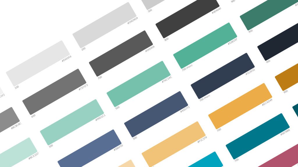
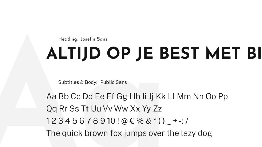
We created a logo that impacts even without branding colours, suits the core of the brand and shows what the brand represents. We looked for a word image consisting of the word ‘Binco’, a visually recognisable element and several prominent colours. Starting points were: Bold – Powerful – Challenging – Competitive – Supportive – Balance & quality. The client chose their logo from multiple proposals that had little different emphases. This logo was then further developed into a brand identity. Besides the logo, colour palette and typography, we also applied the brand identity to a design for letter paper, business cards and a Powerpoint template.
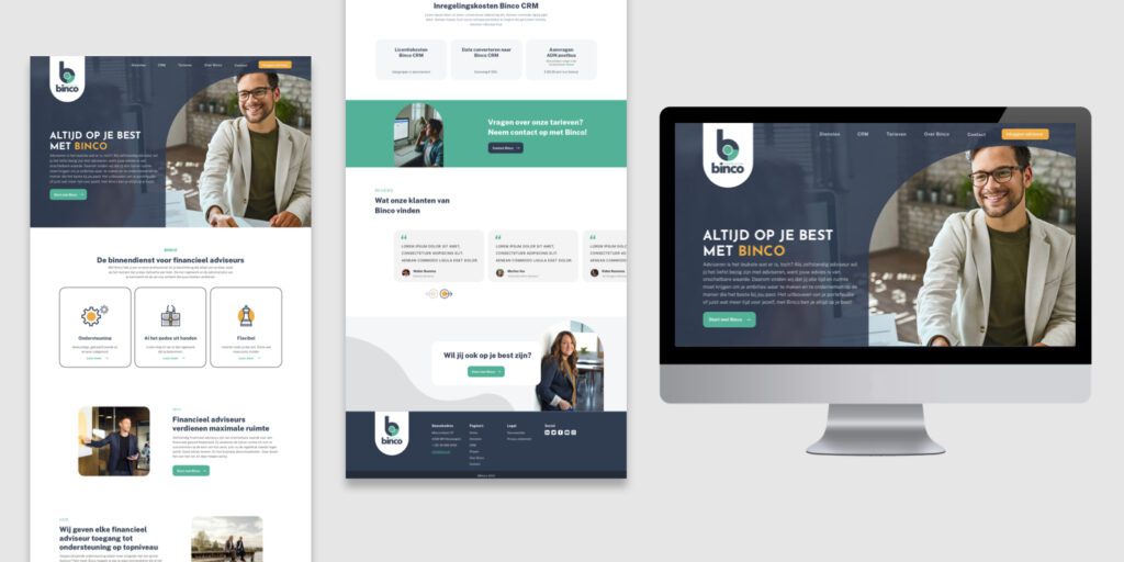
After we finished the brand identity, we translated this into a web design. The primary goal of the website is to inform the potential target audience about the services Binco offers and convince interested financial advisors to contact Binco. Visually, the brand identity of Binco can be found in the colour and font choices. SowiesoDigital built the entire website in WordPress. A significant advantage of WordPress is that the client can fill pages determined beforehand.
With that in mind, we developed the website with flexible content blocks. Think of different sorts of text blocks, a pricing block, a block containing reviews etc. Very user-friendly.
In addition, a WordPress website is easy to keep up-to-date. A client can build new pages himself with these content blocks or adjust/expand existing pages by placing or adding other content blocks. These blocks automatically get the right look & feel and ‘just’ need to be filled with content. If desired, SowiesoDigital can also provide that content – we do so for several customers already – but the customer can also work with the WordPress website themselves.
Services we used to realise this website
