The solution
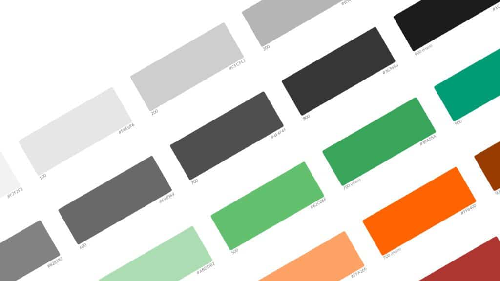
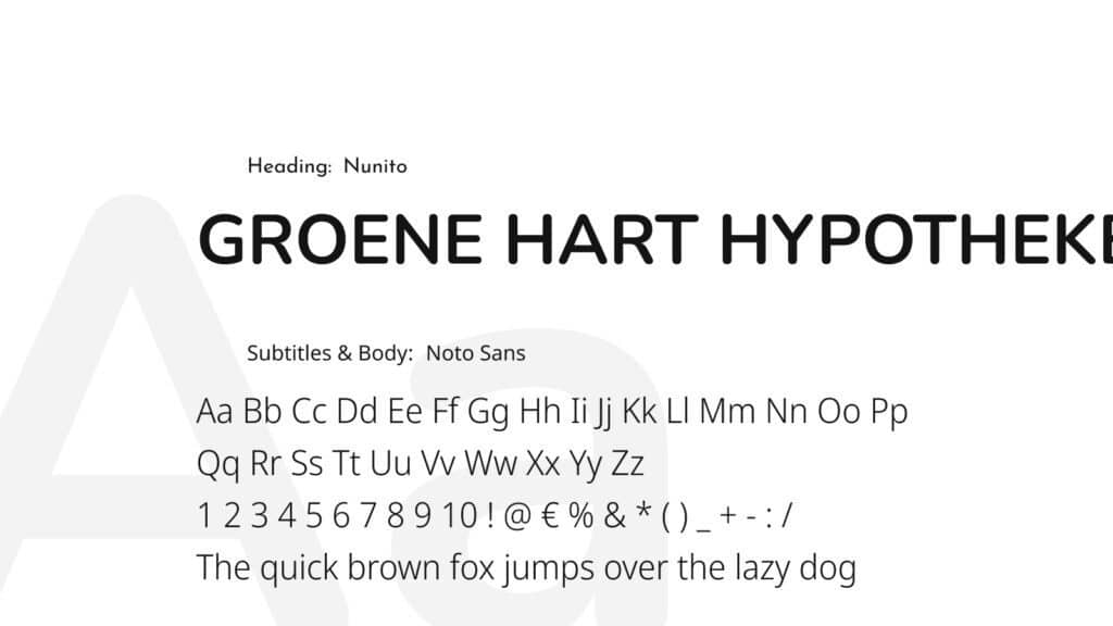
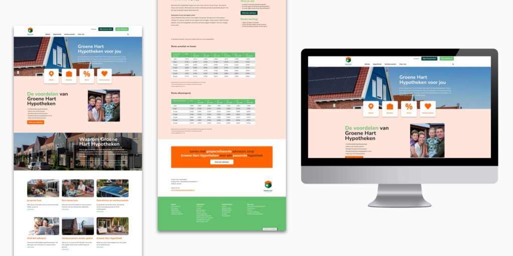
SowiesoDigital made a new design based on the website of Tulp Hypotheken and customised it to fit the new brand identity of Groene Hart Hypotheken. We have applied this design to the concept of the WordPress website of Tulp Hypotheken. Compared to the initial website, we implemented some minor changes to ensure we can place all content in the template.
Besides that, we immediately optimised the technical aspect of the website to ensure it is up to par and the client can work with it for years to come.
The Bespaarcheck is also included in the website as an iFrame. Via user management in the CMS, we enabled collaborating partners to update their share of the information, whether this concerns mortgage information, new sustainability improvements or current interest rates. On a second iFrame, ‘search an advisor’ is shown, which solely reveals advisors that keep sustainability in the back of their minds. This is a first in the market.
The result
On short notice, a new website is ‘re-‘made using a current website design as a foundation. By applying Groene Hart Hypothekens branding to it, the website has a completely different look than the original. In short: a successful launch of this new proposition, all on a website that can tell everybody the sustainable message to everyone that wants a ‘green mortgage’. And soon after the website’s launch, Groene Hart Hypotheek granted the first loans and the first sustainability trajectories of De Energiebespaarders started. To a more sustainable Netherlands!
Services we used to realise this website
